Limo: A little sip of adventure!
I brought Limo to life through a playful, colourful brand identity inspired by nature, friendly characters and fruity flavours. From packaging to campaign visuals, every detail creates a recognisable and consistent brand for children!
- Role
- Graphic designer (branding) & illustrator
- Client
- Whole Earth Foods (school assignment)
- Tools
- Adobe Illustrator, Adobe Photoshop, AI for mockups and campaign visual
The challenge
What if a healthy lemonade for kids could be just as fun as it is refreshing?
Whole Earth Foods challenged me to create a completely new brand identity for one of three drinks: a health-conscious kombucha, a healthy kids' drink or a healthy energy drink.
As part of a team, I worked on the Healthy Kids Drink, which we named Limo!
My challenge was to bring this new children's lemonade brand to life through a complete visual identity, including packaging designs for individual cans and a six-pack.
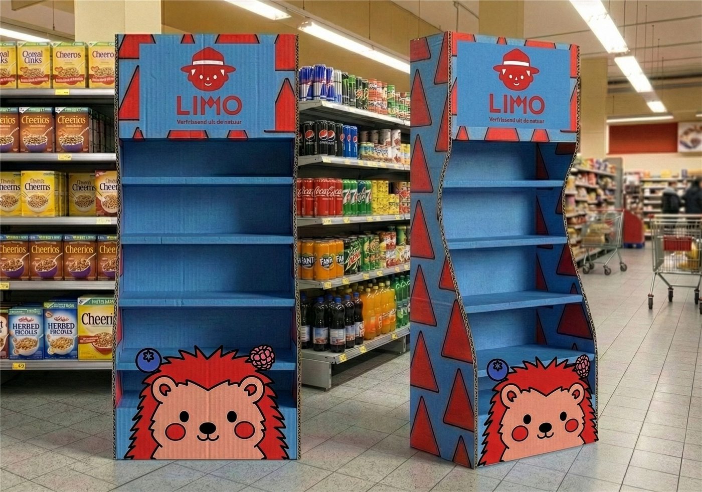
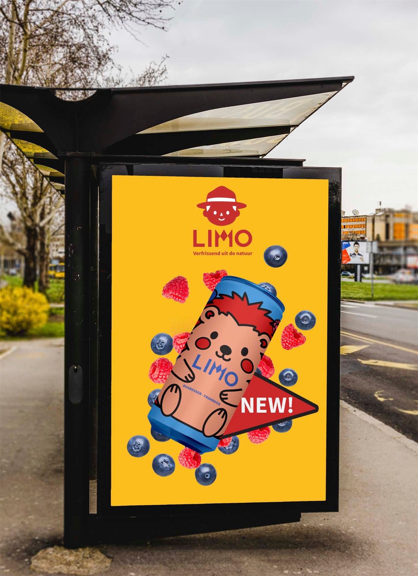
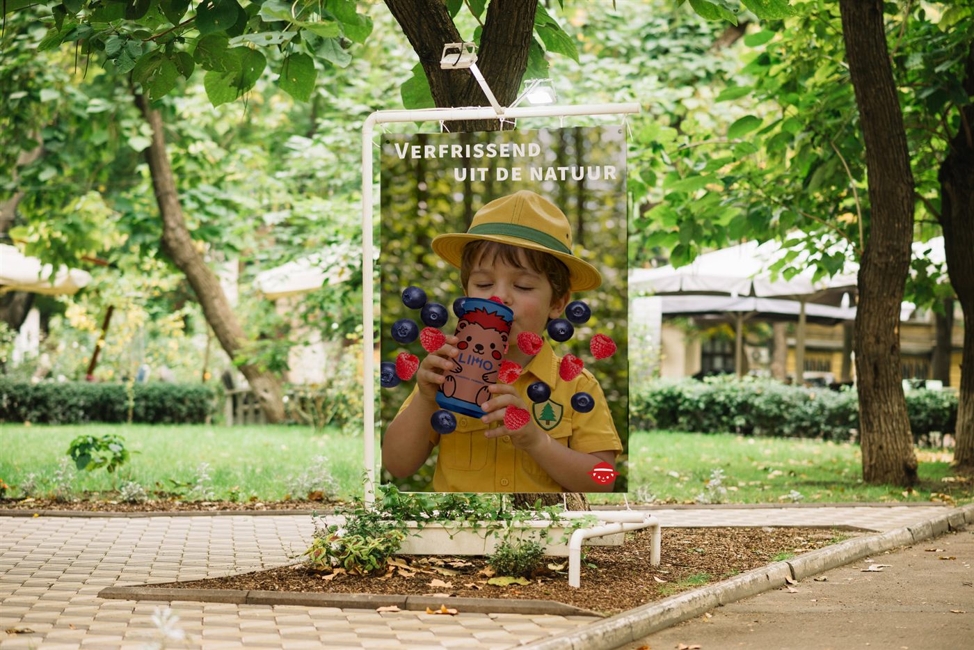
But it didn't stop at packaging! I also had to explore how Limo could connect and communicate with children and their parents through different channels.
The goal? To create a playful, recognisable and engaging brand that appeals to children, from its visual identity and packaging to a complete communication campaign!
My approach
Bringing Limo to life!
How do I make a healthy drink exciting for kids while also appealing to their parents? That was my challenge!
My approach was to create a brand that feels playful, colourful and approachable, without losing sight of its healthy positioning.
I wanted Limo to be more than just a drink. My goal was to develop a recognisable identity that could come to life across the cans, six-pack packaging and communication campaign.
The idea? To find the perfect balance between fun for kids and a trustworthy feeling for parents!
Brand colours
One brand, endless adventures!
For Limo, I created a general colour palette inspired by nature that stays consistent throughout every campaign. Each colour represents a little piece of the forest!
- Yellow: Represents the warmth and brightness of the sun.
- Blue: Inspired by water, bringing a fresh feeling to the brand.
- Green: Represents the leaves of the trees and the natural environment.
- Dark brown: Inspired by tree trunks, adding an earthy touch.
- Red & orange: Represent the colourful fruits found in nature.
- Black & white: Serve as neutral colours, creating contrast and balance.
Alongside these fixed brand colours, I developed a unique colour palette for each edition, inspired by its forest animal and fruity flavour.
This way, every new drink gets its own personality while still feeling like part of the same Limo family!
The idea? A consistent brand identity with plenty of room for colourful new adventures!
Brand colours
- Yellow
#FFDB0F - Blue
#4E91CE - Green
#69B760 - Red
#C61F18 - Orange
#F28A25 - Black
#000000 - White
#FFFFFF
Colour palette
A berry colourful adventure!
For this edition of Limo, I created a playful and vibrant colour palette inspired by the hedgehog and the fruity combination of blueberries and raspberries!
Every colour has its own purpose, helping to bring the character, flavour and packaging together.
- Red: Represents the hedgehog's spines and is used as a main colour in the icon.
- Pink: Inspired by the raspberries, making the fruity flavour instantly recognisable.
- Dark blue: A deeper shade of blue, used for the brand name and blueberries.
- Light blue: Creates a fresh, cheerful background for both the can and six-pack packaging.
- Salmon pink: A softer variation of red, used for the hedgehog's skin to give it a friendly appearance.
- Black: Defines the outlines, making the illustrations clear and recognisable.
- White: Adds contrast and is used to fill the remaining parts of the icon.
By combining bright fruity colours with softer shades and strong outlines, I wanted to create a cheerful identity that appeals to children while keeping the illustrations easy to recognise.
The result? A colourful little world where every shade has a purpose and the flavour comes to life! ;)
Blueberry & raspberry edition
- Red
#C61F18 - Pink
#E44279 - Dark blue
#42519D - Light blue
#4E91CE - Salmon pink
#E59A7F - Black
#000000 - White
#FFFFFF
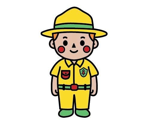
Meet Pim the forest ranger!
What better way to make a children's lemonade memorable than with a little forest adventure?
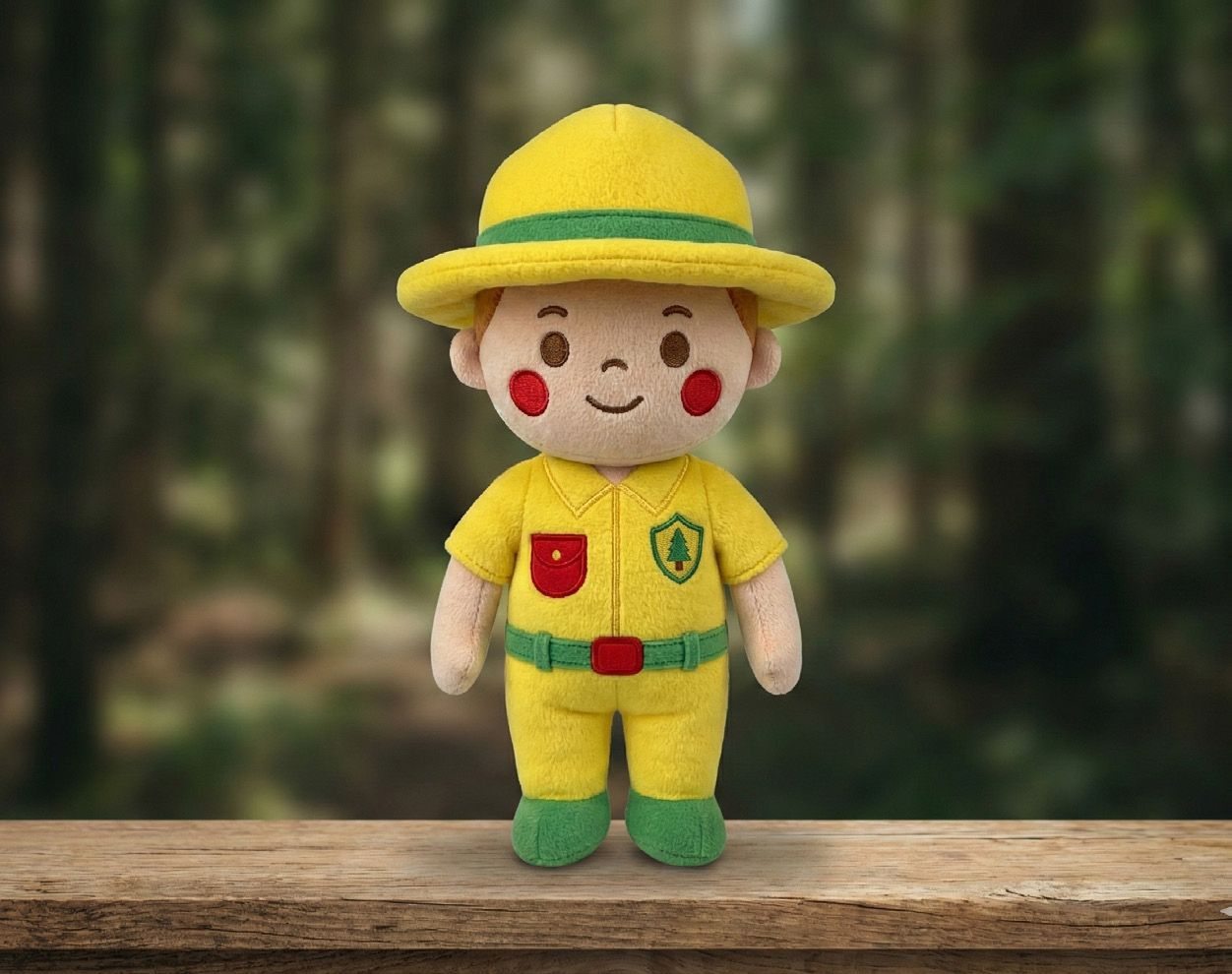
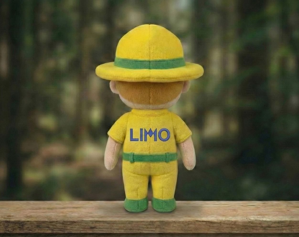
For Limo, I created Pim the Forest Ranger, a friendly mascot who guides children through the world of Limo and appears in every campaign.
Each flavour gets its own forest animal, with a flavour that matches the animal's character.
But why a mascot? Recognition and consistency! By keeping Pim as a familiar face throughout every campaign, I wanted to create a strong and recognisable brand identity.
This is especially important for my target audience: children. A recurring character helps them recognise the brand, connect with it and remember it more easily.
The idea? One familiar forest ranger, different animal friends and a whole lot of fruity adventures! ;)
Name, slogan and logo
A little piece of nature!
The name Limo comes from the Dutch word limonade. I chose this short and playful name with my target audience in mind: children aged 5 and up. Inspired by their language development, I wanted a name that is simple, easy to pronounce and remember.
For the logo, I chose Pim the Forest Ranger's head as the main visual element. Since Pim is the central character of the brand, his face creates a recognisable identity that connects the logo to the entire Limo universe.
For the logo typography, I chose Josefin Sans, a clean and simple typeface with a friendly appearance. I customised the letter M by giving it the shape of mountains, adding a playful reference to nature while making the wordmark more unique.
For the slogan and body text, I selected Source Sans Pro. Its clear and highly readable letterforms help keep the communication accessible and easy to understand, especially for my young target audience.
The slogan was inspired by the refreshing taste of fruit from nature, connecting the drink's fruity character to its forest-inspired identity.
The goal? To create a playful, memorable brand where every little detail tells a part of Limo's story!
Typefaces
- LIMO
- Josefin Sans, logo (with a custom mountain M)
- Verfrissend uit de natuur
- Source Sans Pro, slogan and body text
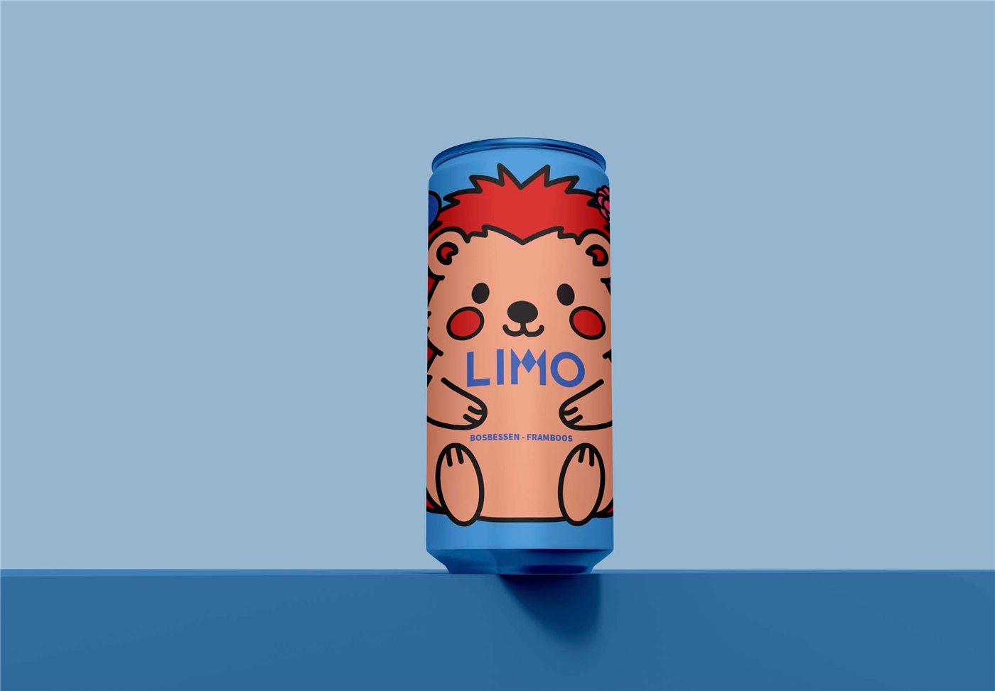
A berry special little hedgehog!
For my lemonade, I chose a fruity combination of blueberry and raspberry. To bring this flavour to life, I paired it with a hedgehog, a little forest animal that also enjoys eating berries!
Next came the challenge: where should my little hedgehog go?
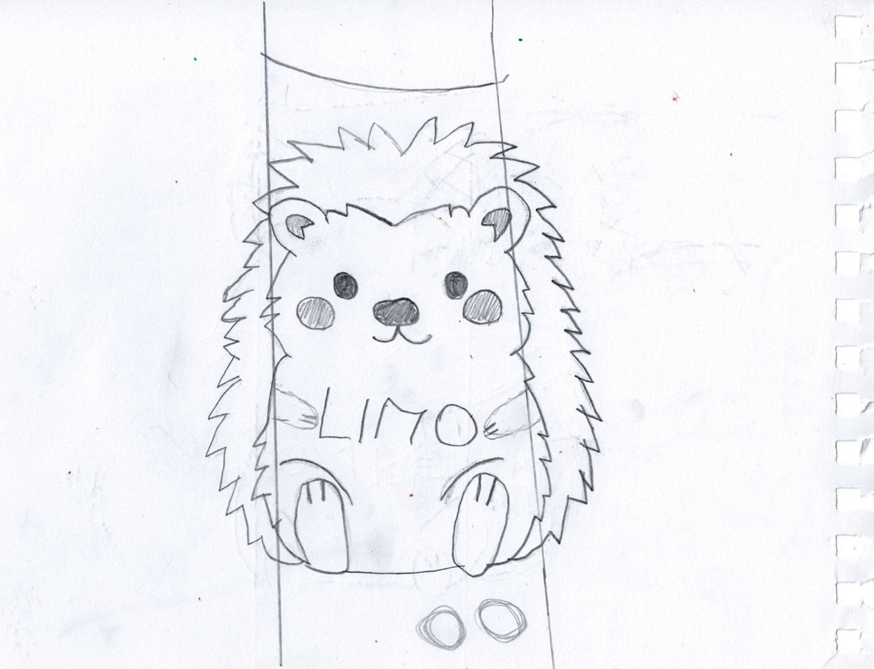
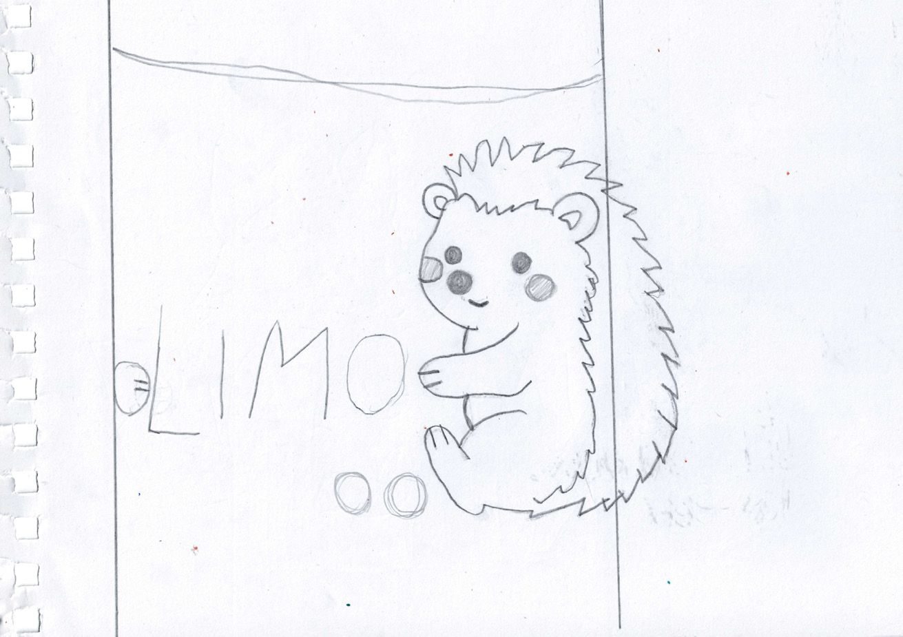
I experimented with two different positions on the can to find the best composition. I wanted the hedgehog to stand out while keeping the packaging playful, balanced and easy to recognise for children.
The goal? To create a fun and meaningful connection between the flavour, the character and the packaging!
Finding the perfect look!
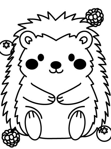
After experimenting with two different positions for my little hedgehog, I decided to go with the front-facing version. This made the character the main focus of the can design, giving it a friendly and recognisable appearance.
To bring the flavour to life, I added blueberries and raspberries as playful graphic elements around the hedgehog.
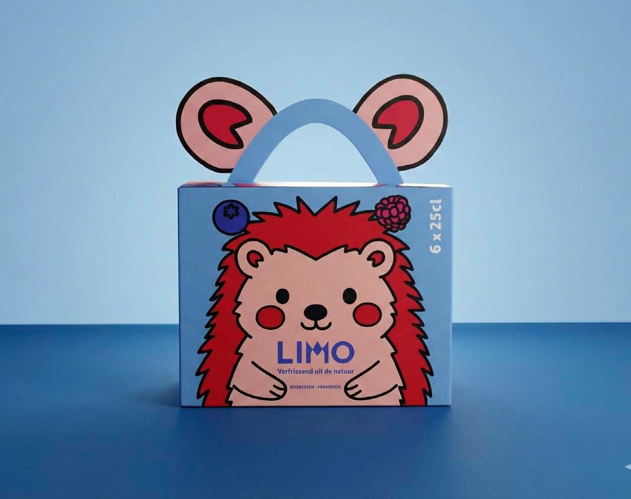
These fruity elements also return on the six-pack packaging, creating visual consistency between the can and the box.
The result? A playful and recognisable design where the character, flavour and packaging come together!
A hedgehog full of surprises!
Why stop at putting a hedgehog on the can when the packaging itself can become one? ;)
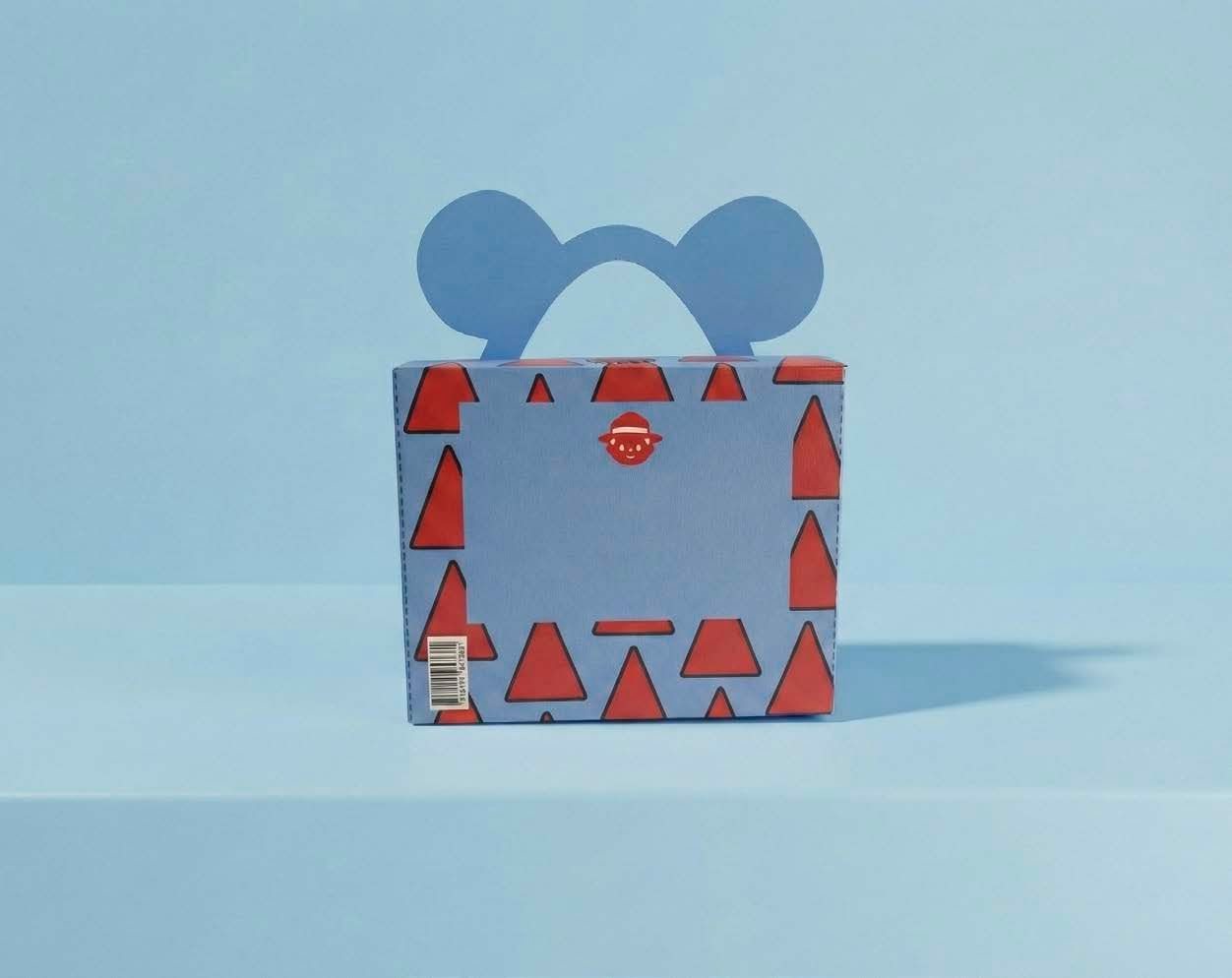
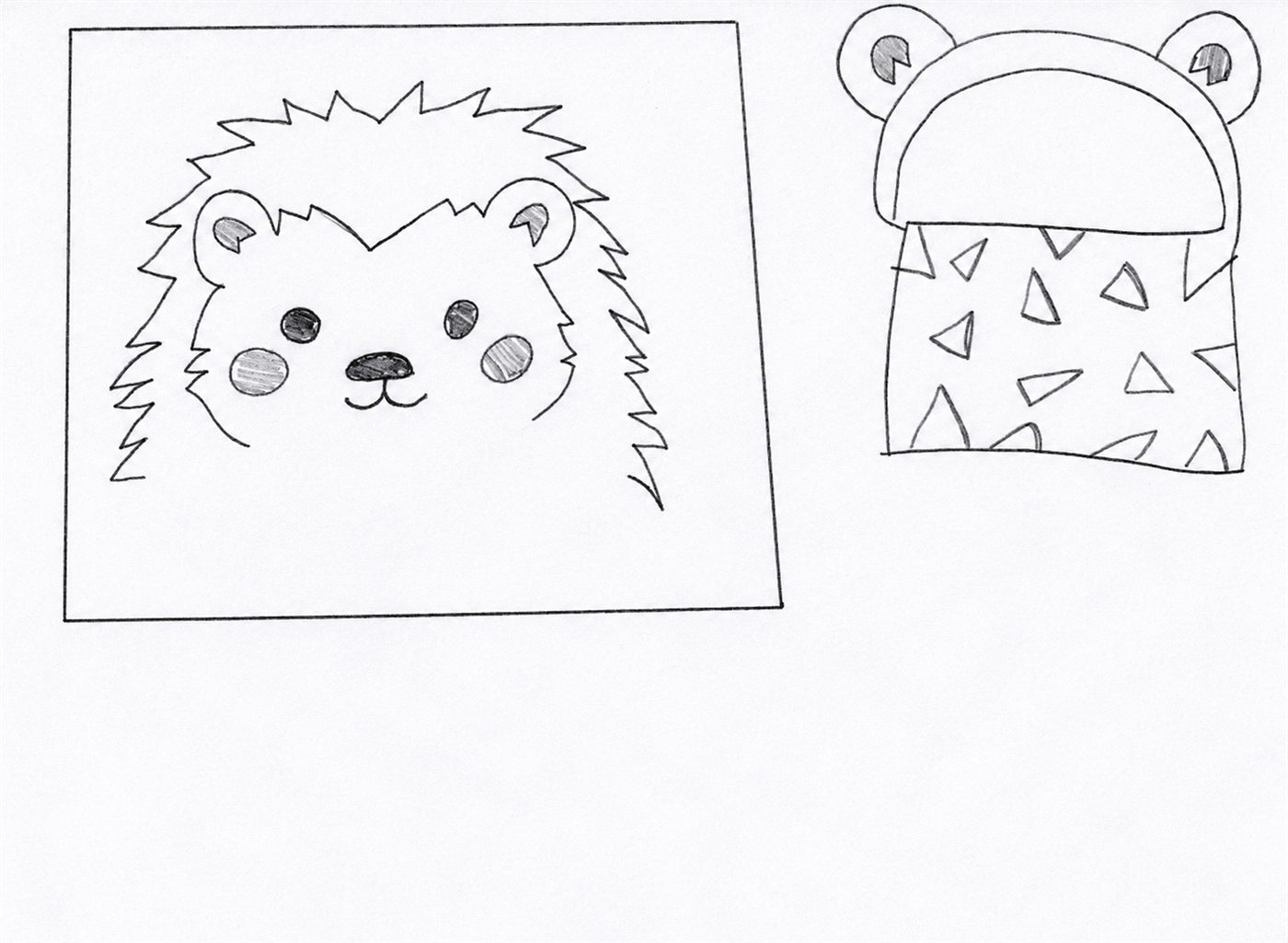
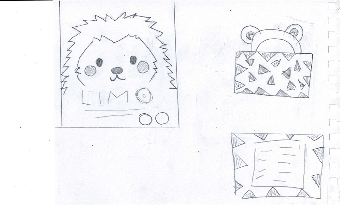
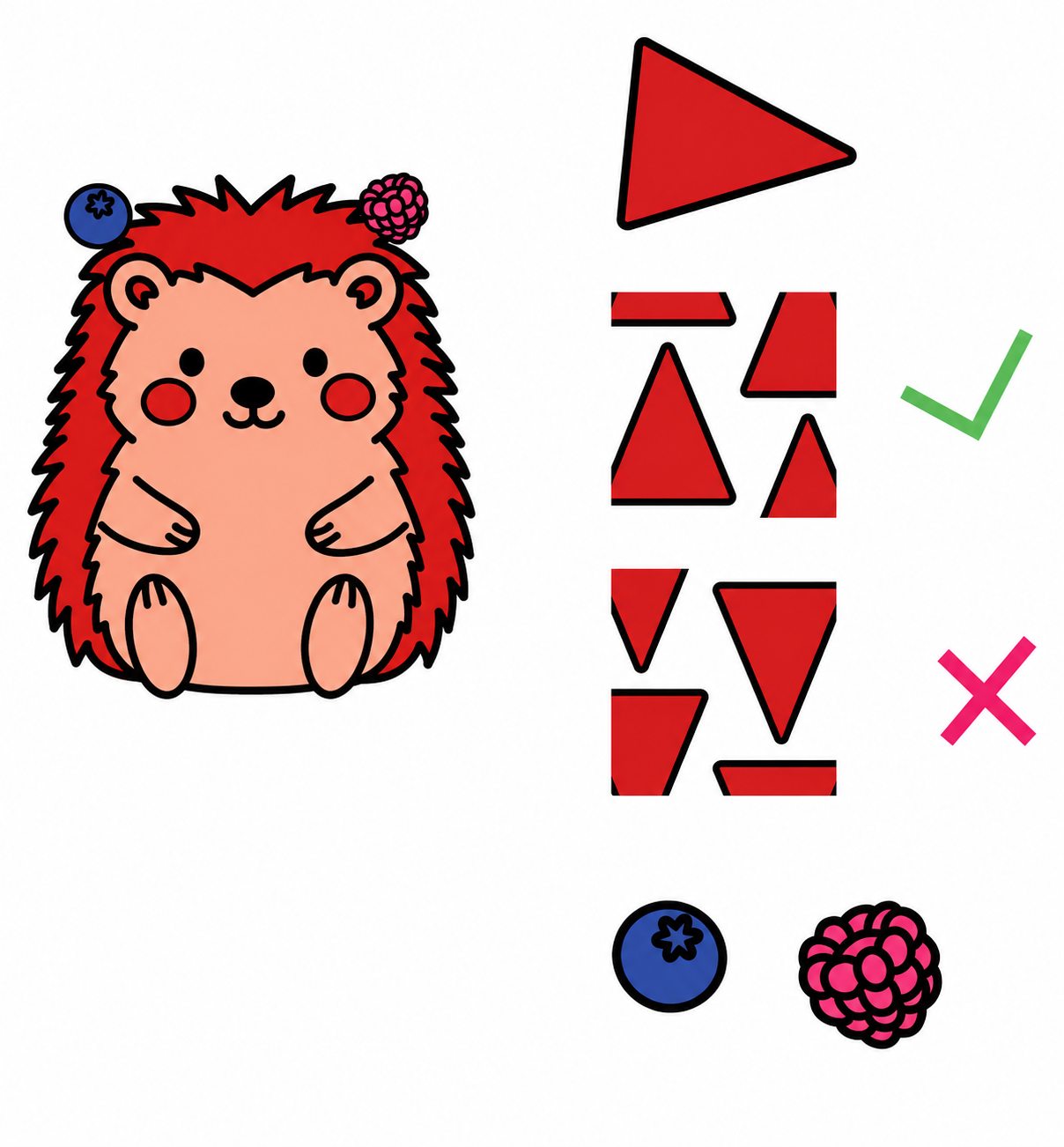
For the six-pack packaging, I took inspiration from the hedgehog's physical features. I transformed its spines into playful graphic elements that appear throughout the design.
I also incorporated the hedgehog's ears into the handle of the box, turning a practical packaging element into a fun part of the character!
The idea? To make the packaging more than just a box by bringing the hedgehog's personality to life through every little detail!
Graphic elements
Inspired by nature!
Every new Limo flavour comes with its own forest animal and unique graphic elements, inspired by the character and the fruits used in the drink.
For my blueberry and raspberry edition, I took inspiration from the hedgehog's spines, transforming them into playful graphic shapes. These can be used individually or combined into a repeating pattern, adding personality to the packaging.
I also turned blueberries and raspberries into graphic elements, making the flavour visually recognisable.
By bringing these elements together across the cans, six-pack packaging and campaign, I wanted to create a consistent yet flexible visual identity.
The idea? Every flavour tells its own little story, while still being part of the Limo family! ;)
The result